Analytics for Authors blogs have been edited to reflect the 01/16/2013 Google Analytics update.
—
Analytics for Authors introduced you to the Audience Overview dashboard in our last post – but before we dive into more sections of Google Analytics and learn how to compare data sets, what’s some helpful information we can gain from the Audience section?
Your Visitors’ Browser Data on Google Analytics
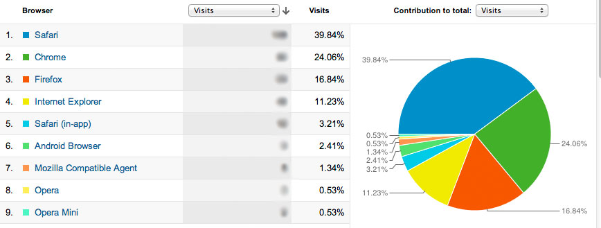
Take a gander at the Browser & OS tab, located under the Technology dropdown menu:

More than 50% of this site’s visitors are using the desktop version of Safari, Chrome, and Firefox, while the other portion is split between Internet Explorer and mobile browsers.
By clicking on the name of the browser, you can see what version of the browser the visitor used to access your site.
Let’s take a deeper look at the Internet Explorer data:

Although the majority of the visitors using Internet Explorer are using the most up-to-date iteration of IE, close to a quarter are using an outdated version.
Why your Visitors’ Browser and Browser Version Matter
You have no control over what browser your visitor will use to view your site.
You have no control over whether your visitors update their browsers or not.
You only have control over how accessible your site is.
If the majority of your visitors are using the latest version of their browser, you don’t need to fret about using new plugins through WordPress or having incompatible formatting. But if a large portion of your visitors are using outdated or non-standard browsers, you will need to tread carefully and choose your design elements with caution.
Swenson Book Development has blogged about why you should be using the latest version of your browser, but when it comes to your visitors you only have one option – test your site in whatever browser (and browser version) they’re using.
Using Google Analytics Data for Optimum Cross-Browser Compatibility
Although it is highly recommended to make sure your website is accessible across as many browsers as possible before launch, you may not have tested on the browsers that your visitors actually use. You may also discover that your visitors are using a very old browser version – or even a browser you’ve never heard of before. It’s not feasible to do in-depth testing on every browser, but once you know what’s most popular for your site you can fine tune your website experience to your audience.
Cross-Browser Testing: Standard Desktop Browsers
Let’s pretend that a much larger percentage of our visitors are using Internet Explorer 7. How can we see what they’re seeing?
Adobe BrowserLab lets you explore your website from several versions of Internet Explorer as well as Chrome, Firefox, and Safari. It doesn’t have all versions of these browsers, but it does give you access to several iterations of Internet Explorer with an easy-to-use, side-by-side comparison.

As you can see, Internet Explorer 7 adds additional white space around the page elements. This is an instance where you have to weigh whether its worth your time to find workarounds to make your site look identical in both versions.
Cross-Browser Testing: Non-Standard Desktop Browsers
If you find your visitors are using a very old version of a browser or a browser you’ve never heard of before (Camino? Midori? IceWeasel?), give BrowserShots a try.
BrowersShots’ only drawbacks is it’s not instantaneous – paying users ‘queue’ ahead of non-paying viewers, so you may have to wait for your results. There is also a 145 screenshot/day cap, although if you are running tests on a single website you likely won’t hit that limit.
Cross-Browser Testing: Mobile
Be aware – many mobile-testing websites are located on sites that sell mobile-ready design services. Although they may not be purposely making your site look bad, check your website on multiple emulators – or preferably the actual mobile device in question – before freaking out or paying up.
GoMo by Google is a fairly decent mobile emulator – though far from perfect.
Check out this screenshot of author Cathryn Prince’s website as emulated by GoMo:

and compare it to a screenshot of what her website actually looks like using Safari on an iPhone:

Way different, right?
So if mobile emulators are unreliable, how can you test your site?
Ask your readers
They are the ones who care! Let them know you want feedback and find out from the people who matter.
Enlist friends and social media
Got a nephew showing off his new iPhone? A girlfriend who never sets down her Android? Use Facebook or Twitter to find someone with the device you want to test on.
We’ve blogged about going mobile before, and with the data you get from Google Analytics you can know if mobile is a necessity or a luxury.
Analytics for Authors will next explore your Google Analytics Traffic Statistics. We’ll show you how to understand the data about the ways people end up at your site – and prepare to be surprised by what’s really bringing people in.
Do you use a great mobile emulator? Please let us know in the comments!
